CelesteCS Chart (from 2026-09-16: renamed from the generic "Chart" to avoid being confused with Confluence's own built-in legacy Chart macro, which has the same short name and shows up right next to it in the macro browser search results - look for CelesteCS Chart specifically, not just "Chart") renders a Bar, Line or Pie chart as a diagram, built directly from a range of cells on the page (and, optionally, a range of cells to use as labels). Just like Numerical Expression's formulas, the chart is recalculated fresh on every page view, so it always stays in sync with the underlying table data – no manual re-drawing or re-uploading an image is needed when the source numbers change.
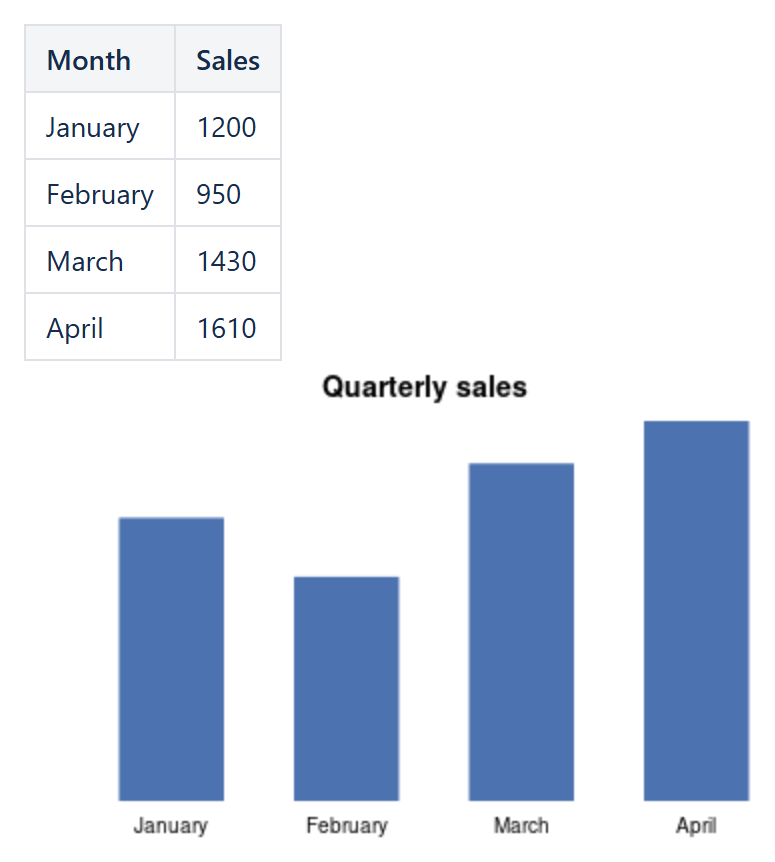
Example: a bar chart drawn by CelesteCS Chart from the Sales column of the table above it.
New!
Chart macro has the following parameters:
| Parameter | Description |
|---|---|
| [String] Data range (required) | The range of cells to plot, specified using the same Excel-like range-reference syntax as other Math macros and functions, for example 'Table1.B2:B6'. The range may be located on the current or another wiki page, just as with Numerical Expression operands. Must be a single column or a single row - a range spanning multiple columns and multiple rows at once is not supported. |
| [String] Labels range (default=empty) | An optional range of cells to use as labels for each data point – category names for a Bar or Pie chart, or point labels along a Line chart. When left empty, the data points are drawn with no labels at all. If supplied but shorter than the data range, the extra data point(s) beyond the end of the labels range are drawn unlabelled rather than causing an error. |
| [Enum] Chart type (default='Bar') | The type of chart to draw. May have one of the following values:
|
| [String] Title (default=empty) | An optional title shown above the chart. |
| [String] Color (default='#4C72B0') | The chart's fill/line color. Accepts a HEX color code (#rgb or #rrggbb) or a plain CSS color keyword name (for example 'blue'); any other value falls back to the default color. |
The chart is drawn as a self-contained diagram directly in the page – no external image file or attachment is created – and, like all Math macros, is recalculated on every page load, so it always reflects the current values in the referenced range.